Email Design Trends: Visual Strategies for Better Engagement
Introduction: The Ever-Evolving Canvas of the Inbox
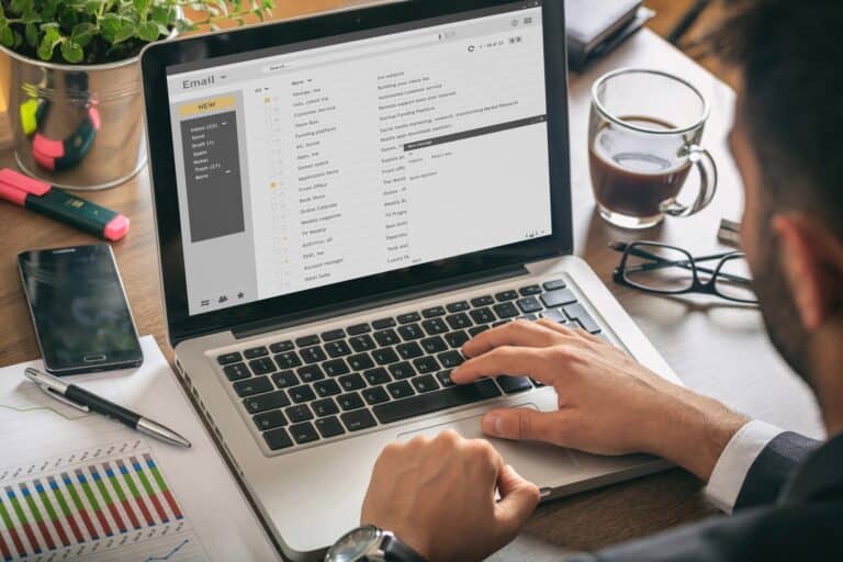
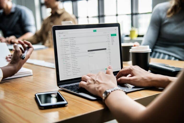
Think about your own inbox. What emails do you actually open, let alone click? It ain’t just the subject line anymore. In a sea of digital messages, what truly grabs attention is often the visual punch an email packs. Design isn’t just about looking pretty; it’s about guiding the eye, conveying brand identity, and creating an experience that keeps subscribers engaged. The aesthetics of email are always changing, with new trends emerging to capture dwindling attention spans.
At emailbeginner.com, we believe that staying ahead of email design trends is crucial for any creator or business serious about connecting with their audience. It’s how you make your messages pop, stand out from the crowd, and ultimately, drive action. We’re diving deep today into the most impactful email design trends and visual strategies for better engagement, armed with insights that help you build stunning emails that truly resonate. Let’s make your inbox a masterpiece.
Why It Matters: Design’s Undeniable Impact on Your Email Success

Email marketing consistently delivers some of the highest returns on investment. But that ROI is heavily influenced by whether your emails are actually read and clicked. Design is your silent salesperson, working hard to get your message across.
Here’s why staying current with email design trends isn’t just about being fashionable; it’s essential for your bottom line:
- First Impressions Determine Engagement: A visually appealing email instantly signals professionalism and trustworthiness. If your email looks outdated or cluttered, folks might delete it before reading a single word, regardless of your amazing content.
- Boosts Open and Click-Through Rates: Emails with compelling visuals and clean layouts typically see higher open rates (due to curiosity) and significantly higher click-through rates. Good design guides the reader’s eye directly to your call to action.
- Enhances Brand Identity and Recognition: Consistent use of your brand’s colors, fonts, and visual style across your emails reinforces your brand identity. This builds recognition and loyalty over time.
- Improves Readability and Comprehension: Thoughtful design breaks up long blocks of text, uses whitespace effectively, and employs legible fonts. This makes your message easier to digest, especially on mobile devices where reading can be a chore.
- Reduces Unsubscribes: Irrelevant or poorly designed emails are annoying. When your emails are visually appealing and easy to navigate, subscribers are less likely to hit that “unsubscribe” button because they perceive your messages as valuable and professionally delivered.
emailbeginner.com was built to help users like you make smarter decisions with confidence. And in the visual landscape of modern inboxes, strong design is a smart decision that pays dividends.
Key Email Design Trends Shaping Engagement Today
Email design isn’t static; it evolves alongside web design and user expectations. Here are some of the most impactful trends that can help your emails convert better:
1. Minimalist and Clean Layouts
- Trend: Less is more. Clean designs prioritize readability and focus on essential elements, removing visual clutter. This means ample whitespace, simple color palettes, and clear typography.
- Why it’s effective: In a world of constant information overload, minimalist emails provide a calming, easy-to-digest experience. They make your main message and call to action stand out without competing distractions. This trend often contributes to higher perceived professionalism.
- Practical Application: Use a consistent two-color palette (plus black/white), stick to one or two readable fonts, and give elements plenty of padding.
2. Dark Mode Optimization
- Trend: More and more people are using dark mode on their devices. Email clients are catching up, and a well-designed email should look good in both light and dark modes.
- Why it’s effective: Provides a comfortable viewing experience for users in low-light environments or for those who simply prefer it. It shows you care about their preferences.
- Practical Application: Test your emails in dark mode. Use transparent PNGs for logos. Ensure text colors have enough contrast to be readable against a dark background, even if the client tries to invert them. Avoid large, dark background images that might appear jarring in light mode.
3. Bold Typography and Unique Font Pairings
- Trend: Moving beyond basic web-safe fonts. Brands are experimenting with unique font pairings and bold, impactful typography to create visual interest and reinforce brand personality.
- Why it’s effective: Distinctive typography can help your brand stand out and convey a specific tone (e.g., playful, authoritative, elegant). It can also create a strong visual hierarchy, guiding the reader’s eye.
- Practical Application: Use web-safe fonts as fallbacks. Focus on readability first. Use bold headlines to grab attention and subtle font pairings to add sophistication. Tools like Flodesk excel at making Flodesk: Send Stunning Emails Without the Complexity easy to do this.
4. Subtle Animations and Interactivity
- Trend: Incorporating light animations (like GIFs, subtle hover effects for buttons) or basic interactivity (like accordions, image carousels) directly within the email to surprise and delight users.
- Why it’s effective: These elements can significantly increase engagement and make your emails feel more dynamic and modern. They grab attention in a way static images cannot.
- Practical Application: Use GIFs sparingly and ensure they are small in file size for fast loading. Test interactivity across different email clients, as support varies. Don’t overdo it, or your email just looks weird.
5. Data Visualization within Emails
- Trend: Using charts, graphs, and clear infographics directly within emails to convey complex information quickly and effectively.
- Why it’s effective: Visualizing data is often much more digestible than presenting it in plain text. It helps readers grasp insights faster and makes your emails feel more authoritative and valuable.
- Practical Application: Keep data visualizations simple and clean. Use high-contrast colors and clear labels. Ensure they are mobile-responsive and legible on small screens.
6. Personalization Beyond the Name
- Trend: Moving past basic name personalization to dynamic content based on subscriber behavior, purchase history, or preferences.
- Why it’s effective: This makes the email feel truly tailored to the individual, dramatically increasing relevance and conversion rates. It’s like having a conversation, not giving a lecture to a crowd. Our guide on Why Your Ecommerce Store Needs Personalized Email Marketing explains more about this.
- Practical Application: Use your email marketing platform’s segmentation and dynamic content features. Collect zero-party data (preferences shared by the user) to drive this personalization.
Tools That Empower Beautiful Email Design
Creating emails that look stunning across all devices and email clients used to be a nightmare of coding. Thankfully, modern email marketing platforms have robust drag-and-drop builders that put powerful design tools in everyone’s hands.
- Flodesk: This platform is a standout for its visual-first approach. It’s built for creators who prioritize beautiful design without wanting to deal with complex coding. Its unique template library and intuitive editor make it incredibly easy to craft emails that are not just effective, but genuinely gorgeous. For folks who aren’t designers, this tool is a blessing.
- AWeber: A long-standing veteran, AWeber offers a solid drag-and-drop builder with a good selection of templates suitable for various businesses and creators. It balances ease of use with essential features for reliable email delivery.
- ConvertKit: While known for its segmentation, ConvertKit also provides a clean email editor that makes it easy to create engaging, text-forward emails with good visual support, perfect for authentic creator communication.
These tools handle the underlying code and responsiveness, allowing you to focus on the visual strategy. They ensure your emails load fast and look great, no matter where they’re viewed.
Pro Tips for Elevating Your Email Design
- Test on Multiple Devices and Clients: Always, always send test emails to yourself and check them on various devices (phone, tablet, desktop) and in different email clients (Gmail, Outlook, Apple Mail). What looks good in one place might break in another.
- Optimize Images for Web: Compress your images to reduce file size. Large images slow down email loading times, which can lead to higher abandonment rates. Aim for a good balance of quality and file size.
- Use Clear Call-to-Action Buttons: Make your buttons prominent, using contrasting colors and action-oriented text. Give them plenty of whitespace so they’re easy to find and click.
- Consider a Preheader/Preview Text: This short snippet appears next to your subject line in the inbox. Use it to expand on your subject line and entice an open. It’s a vital, often overlooked, piece of real estate.
- Stay Brand Consistent: Every email should unmistakably be yours. Use your brand’s logo, colors, and fonts consistently. This builds recognition and trust over time.
Email design isn’t just about making things pretty; it’s a strategic tool for boosting engagement, conversions, and customer loyalty. By embracing current design trends and leveraging user-friendly platforms, you can create emails that not only capture attention but also drive real results for your business. It’s time to make your inbox a canvas for compelling communication.
FAQs
What is the ideal image-to-text ratio for emails?
While there’s no single “ideal” ratio, a good rule of thumb is to aim for around 60% text and 40% images. Emails that are overly image-heavy (e.g., a single large image with minimal text) can sometimes be flagged by spam filters or may not display properly if a user has images disabled.
Why do some emails look broken on mobile devices?
Emails look broken on mobile devices typically because they are not “mobile-responsive.” This means their design doesn’t automatically adapt to smaller screen sizes, leading to horizontal scrolling, tiny text, or elements overlapping. Using modern, responsive email templates from your email marketing platform is crucial to avoid this issue.
What is an email “preheader” or “preview text”?
The preheader or preview text is a short snippet of text that appears next to or below the subject line in a recipient’s inbox. It provides a quick summary or a compelling hook for the email’s content before it’s opened. Optimizing this text can significantly influence whether a subscriber decides to open your email.
Can using custom fonts affect how my email looks to recipients?
Yes, using custom fonts in emails can be tricky. While you might design your email with a specific font, if the recipient’s email client doesn’t have that font installed, it will default to a generic, web-safe font (like Arial or Times New Roman). It’s best practice to use web-safe fonts primarily, or to specify fallback fonts, and use images for highly stylized text.
How can I make my email’s call-to-action (CTA) stand out more?
To make your email’s CTA stand out, use a prominent button with a contrasting color that aligns with your brand. The button text should be action-oriented and concise (e.g., “Shop Now,” “Download Guide”). Place the button in a clear, uncluttered area, often “above the fold” and near relevant content, with ample whitespace around it.
Written by The Editorial Team. Learn how we write and test all our content for accuracy.